PRODU
For 35 years has been the leading provider of content for television, marketing and tech professionals in Latin America market.
Creative Direction
Brand Identity
UX & UI Design
Web Design
Working with PRODU I managed many projects being the creative head of the company, giving me complete freedom to create different strategies for the brand in web, UX & UI design and Motion graphics; training me in decision-making tasks and teamwork.


Logo Redesign
The company had already been in the entertainment market and industry for 30 years and is a well-positioned brand. But my most difficult task was to use the logo that they had been using for a long time and give it a more modern and public-friendly look, which is why the main colors were added to the logo to give more identity to the brand.

PRODU is divided into 4 main groups, Television, Advertising & Marketing , Technology and Hispanic US. In order to create a brand identity that would allow us to understand how the company is constituted, we created 4 colors that would represent these 4 main groups to make navigation easier while you read the featured news in each section.
Color palette and departments
#1328df
#5814b9
#ffce00
When we were making the animation you can see a clear example that using the color bars as the main character to bring the logo to life works to give it more personality and presence making it a more consolidated brand and easier to stand out among others in the entertainment industry.
#1becc5
Logomotion


As part of a creative team, we faced different projects in which it was not only about giving a new approach to the brand but also about how to turn it into something more dynamic and playful.
Creating campaigns within the same company was a daily task, but it was precisely the creation of videos and animations that not only improved our relationship with our clients but also how the public observed the company within the years of experience in the entertainment industry, It was very important that the public saw us with a renewed image.
Campaings

Within its campaigns, PRODU collaborates with other recognized brands in the industry and that helps it continue to promote itself as one of the most complete media in terms of Latin entertainment content.
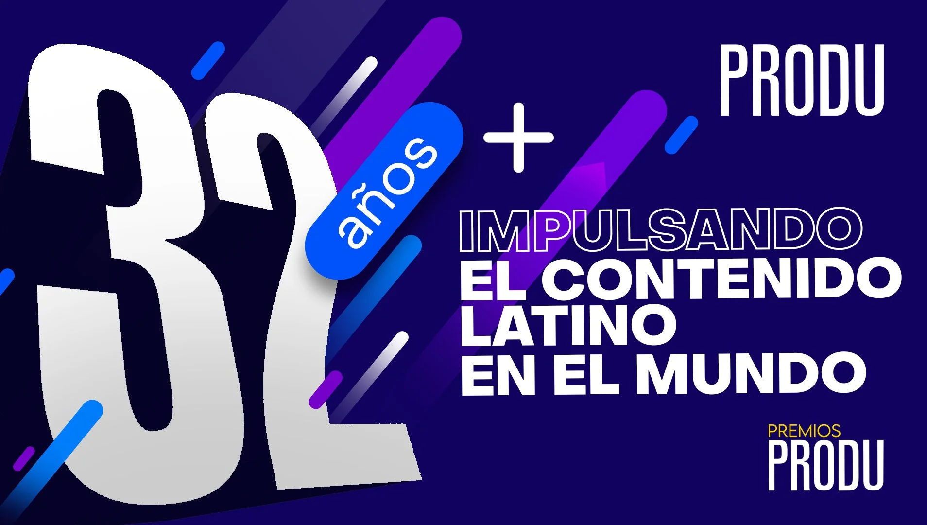
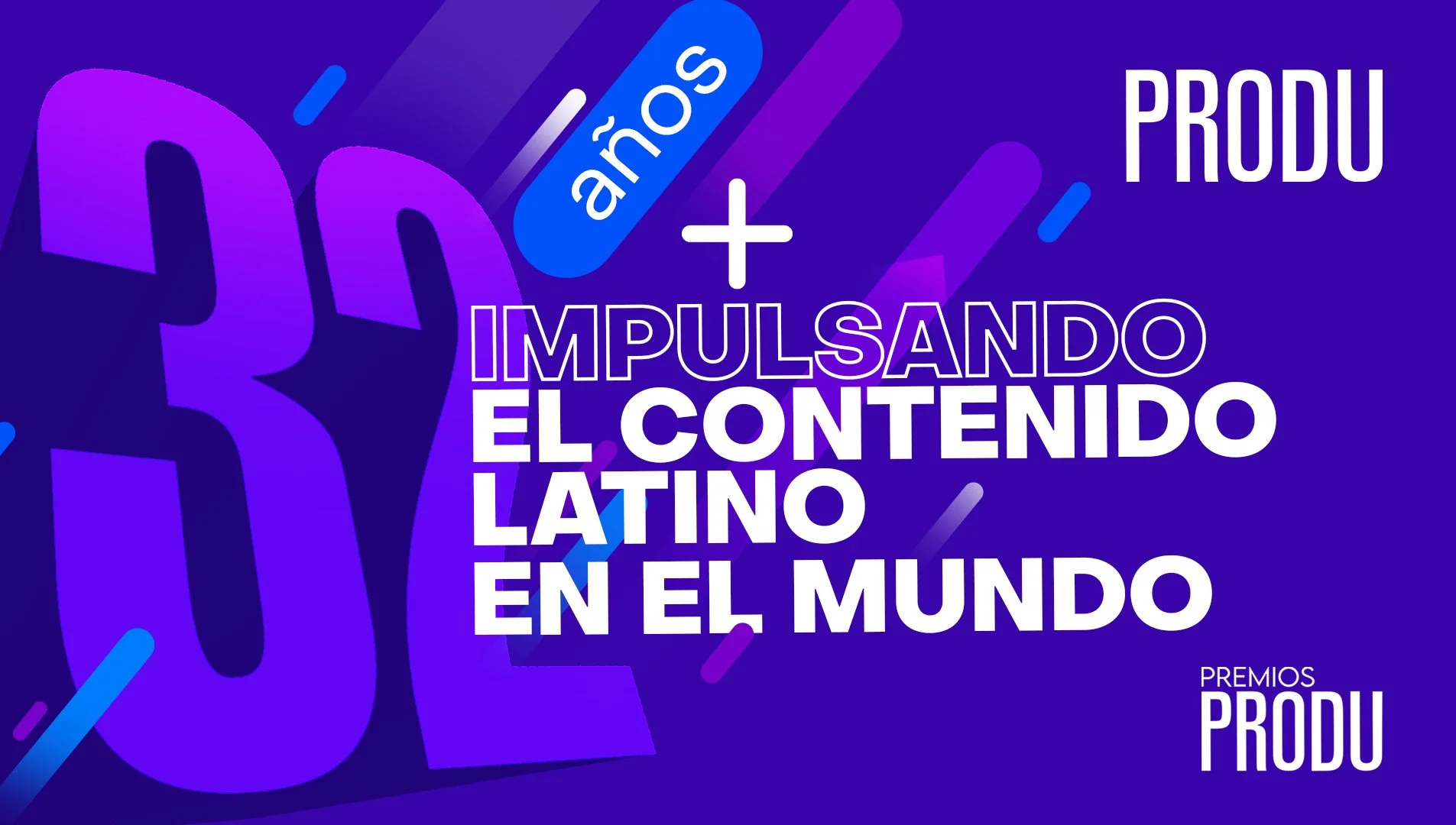
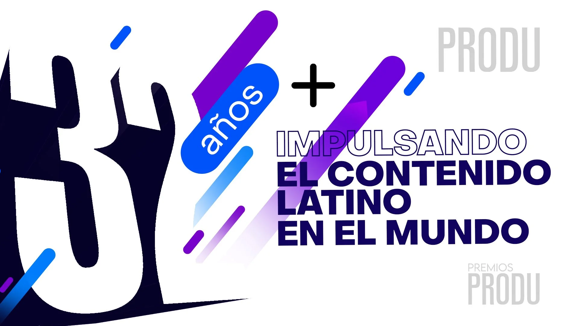
PRODU 32th Anniversary campaing
Having so many years dedicated to supporting the growth of Latin content around the world is not an easy task. But to celebrate their positioning in the Latin industry, it is important to recognize their achievements and career with a campaign that reflects their values and best attributes.
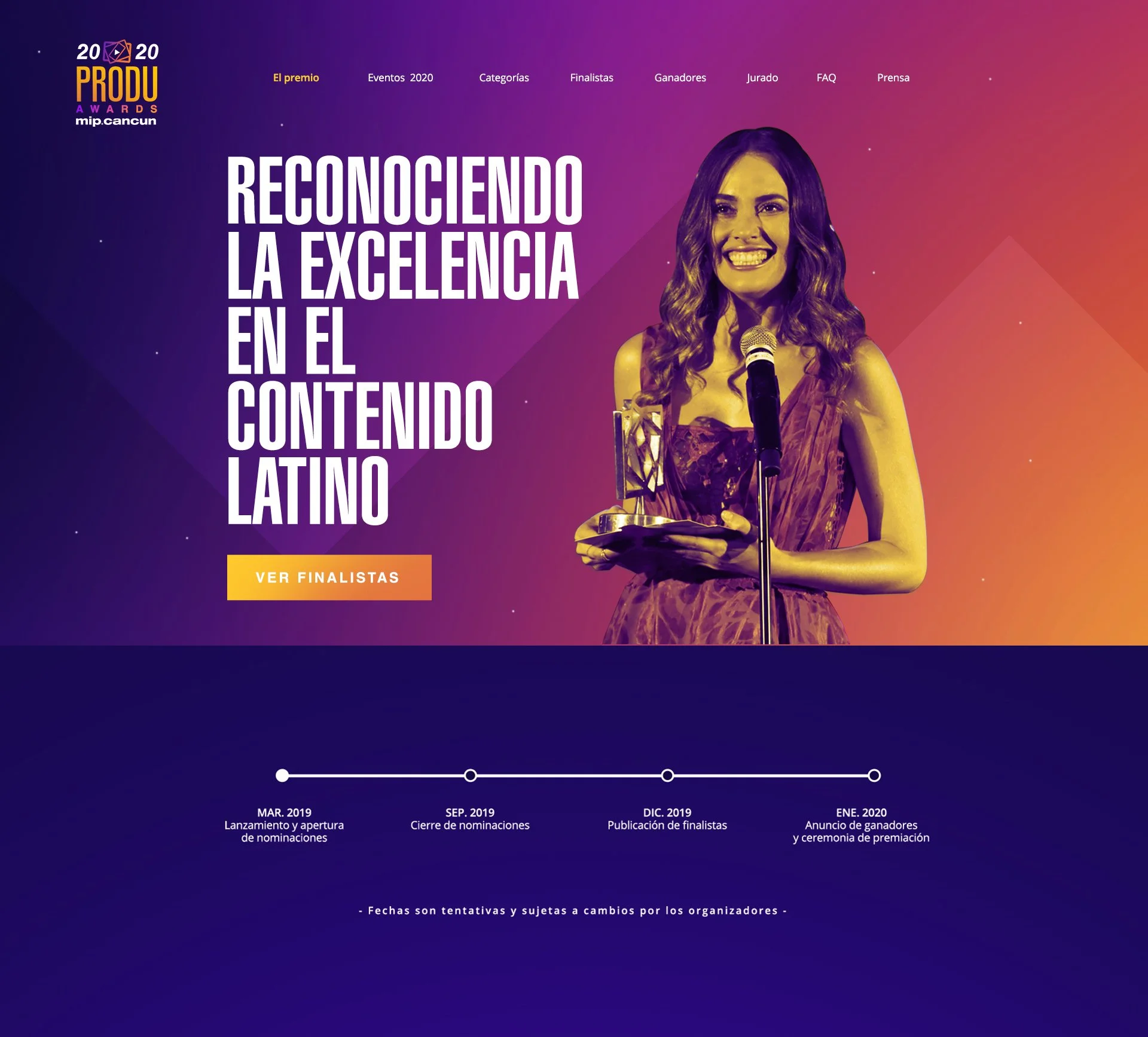
PRODU Awards
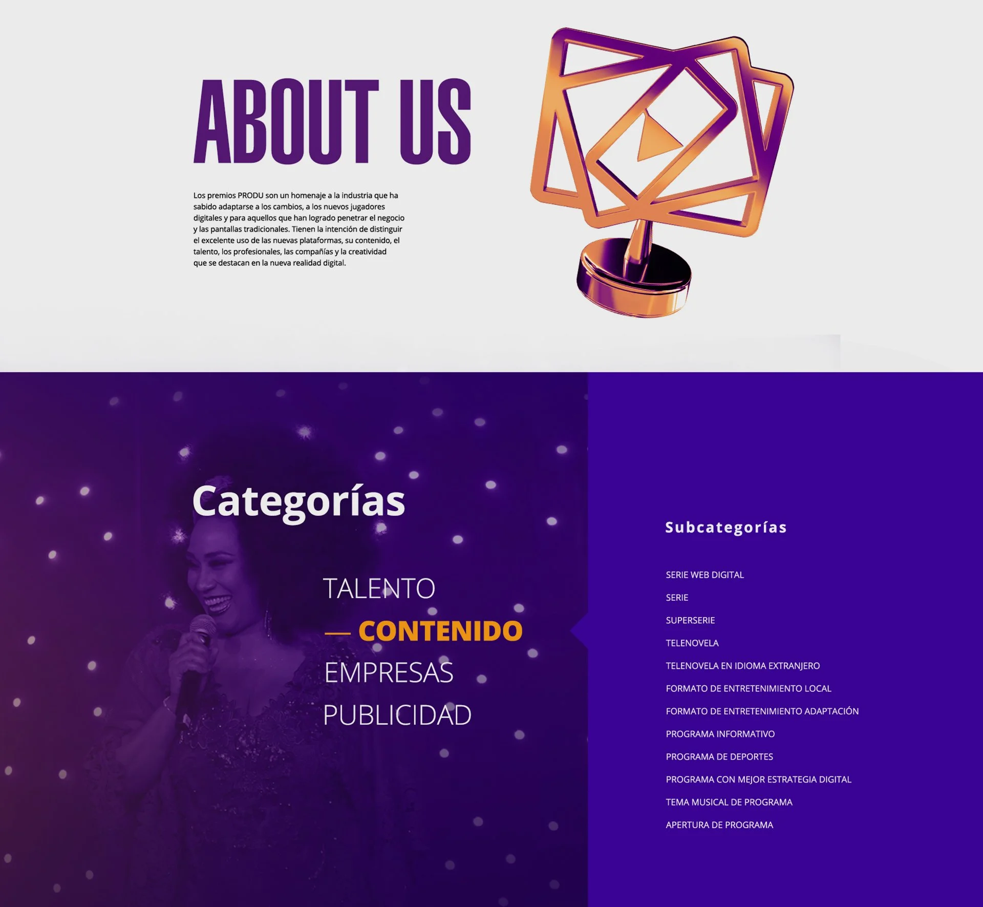
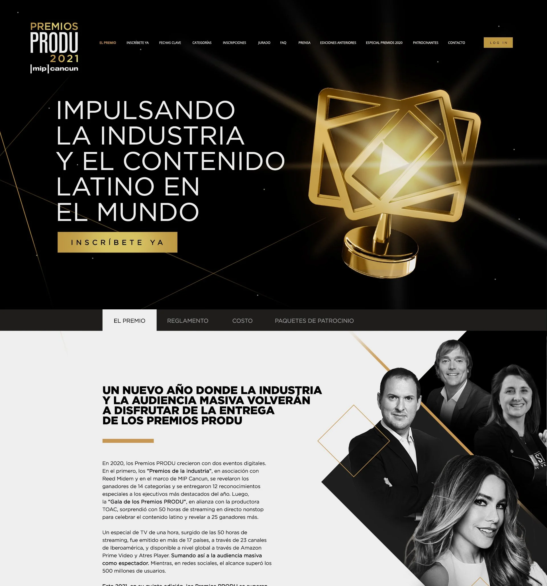
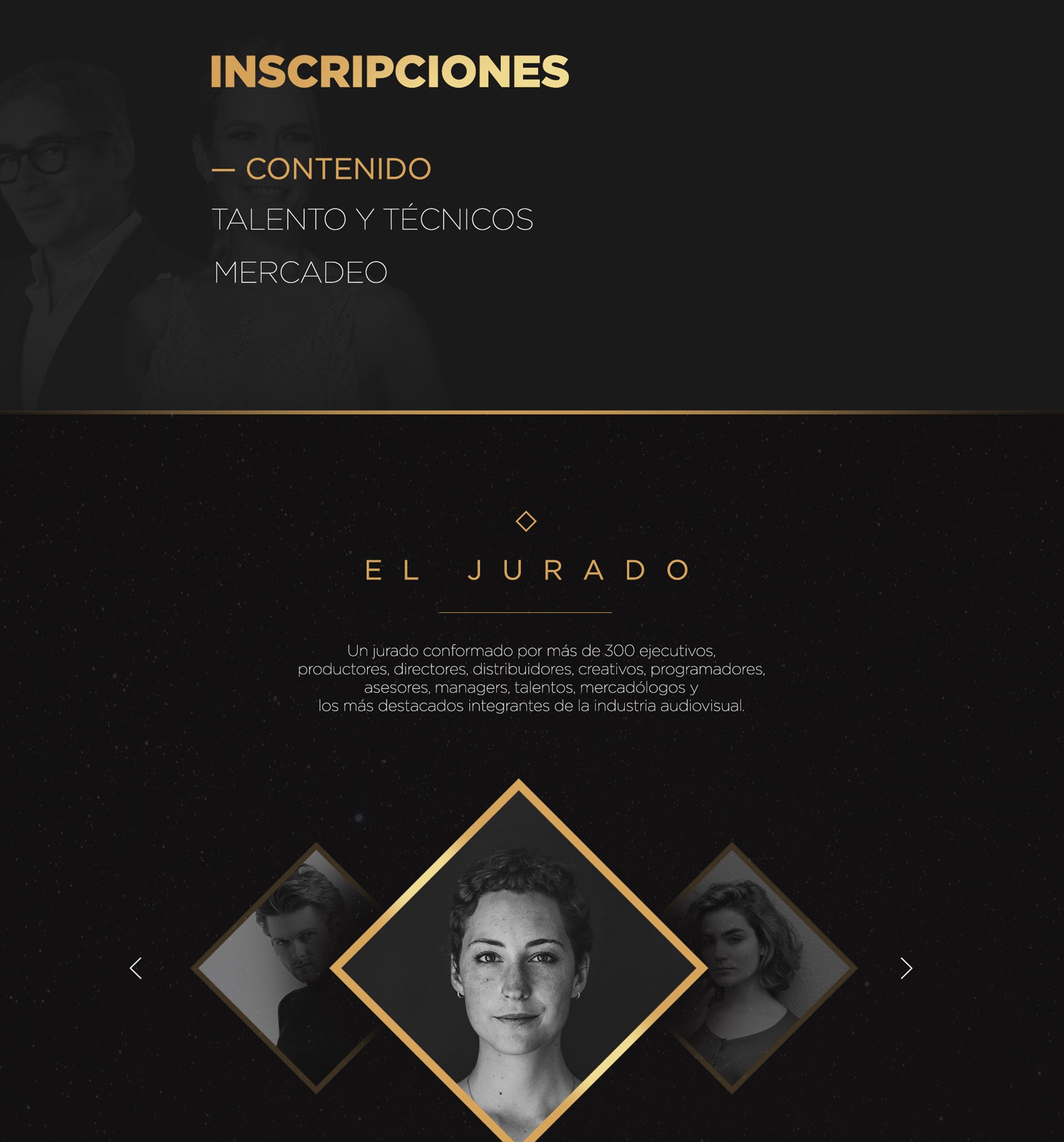
The PRODU Awards are the only awards in the audiovisual industry that seek to recognize excellence in Latin and Spanish production and promote it in the world. PRODU provides the digital platform for an objective and healthy evaluation among colleagues and the experience, objectivity and criteria of the juries guarantee the prestige and success of the awards.
Logo Redesign
For PRODU as a positioned brand, it is very essential that its identity continues to be appreciated in other branches of the same company, as is the case of the PRODU awards, which are a very important part that constitutes it. The logo has to communicate the same message as the main logo.
Website design
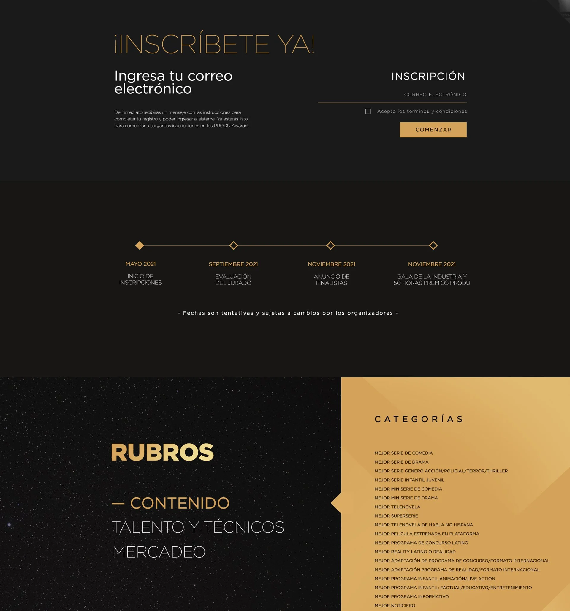
For the design of the PRODU awards page we wanted linear and direct navigation for all those registered in their categories. The process of redesigning the website went through image changes every year, that is why we opted for a more neutral design but that maintained the essence of the awards and lived up to such a prestigious ceremony.
PRODU is divided into several sub-brands that serve to reach different audiences in the entertainment industry and of course having as its main task to promote Latin content in the world. So as a company in constant change and expansion, it was necessary to be able to branch out into different areas.