Goyo´s Bake House
is an open Kitchen concept visible to customer, serving select bakery and good coffee.
Brand Identity
Creating the brand and using the fact of making bread as a starting point, it was very important that the concept could highlight a friendly design as if it were a drawing or handwritten typography, transferring what happens in the kitchen to graphic and present it as a moldable brand design.
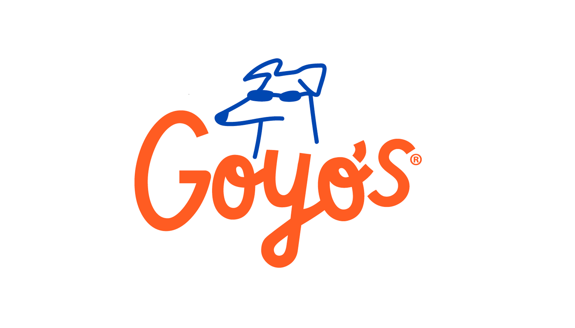
Goyo´s brand name born from the family dog who was called Goyo, and he always stole the bread from the kitchen and that is the perfect inspiration for the bakehouse name, they were seeking a timeless "icon" that could grow to be recognisable without the bakery's name present.

Logo design

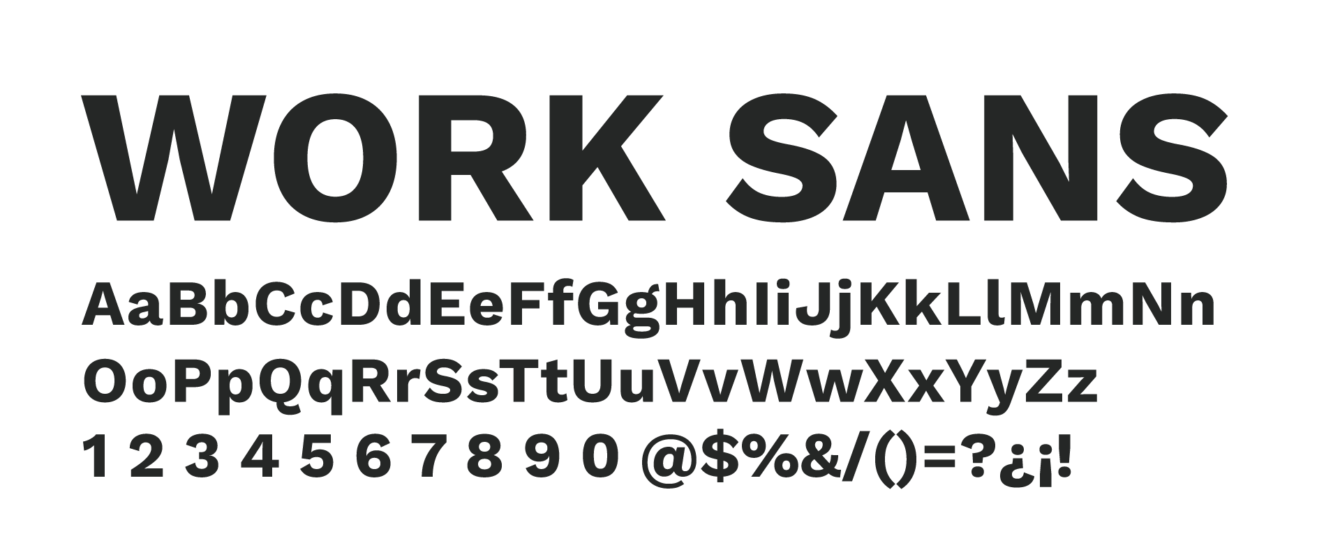
Color palette and font family
#2549AD
#F95C2B
#252726
#F0ECEA
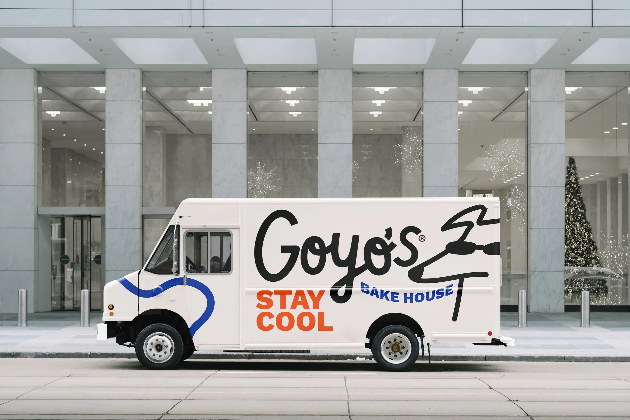
The brand application ranges from the own design of the premises, vehicles distributed throughout the city that function as small bakeries and cafes, the design of posters, logosigns, glasses and cups, etc..
Brand application